APOS Design System
Galenica is a leading Swiss healthcare provider that specializes in pharmaceuticals, healthcare logistics, and retail. I was an integral part of the team that tackled the challenge of developing a comprehensive design system for APOS (Active Point of Sale), the software used by Galenica pharmacies such as Amavita, SunStore, and Coop Vitality.
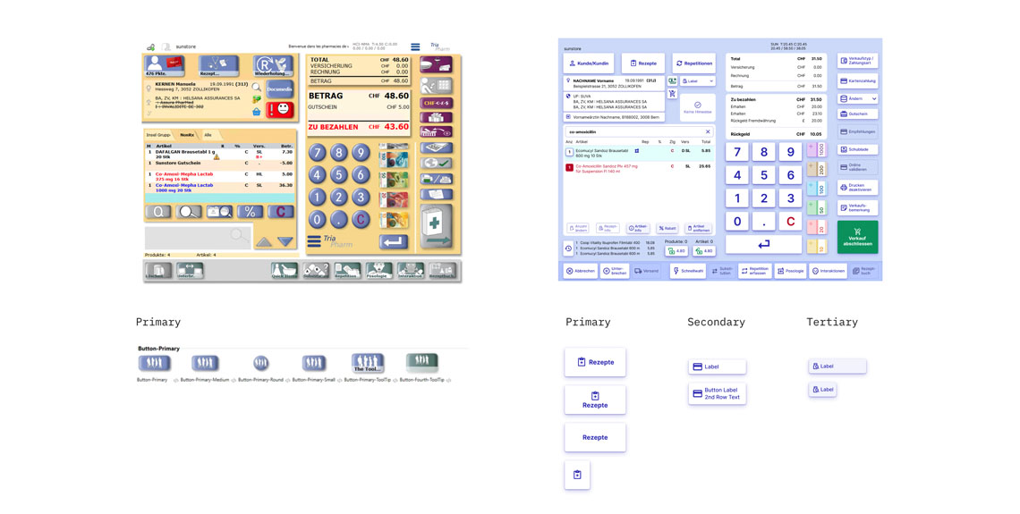
Recognizing that while APOS was functionally robust, it required significant improvements in its user interface design. I had the pleasure to actively contribute to most aspects of this project. One key area of focus was addressing the shortcomings of the existing interface. The team and I worked diligently to overcome issues such as insufficient contrast, vague icons on buttons, and an absence of clear visual hierarchy in the color scheme. Additionally, we tackled the lack of distinction between primary and secondary actions due to all buttons being coded as primary.
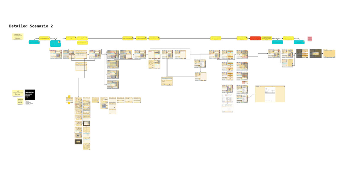
To drive this transformation, our development team embarked on a comprehensive mission. Collaborating closely, we initiated user research and engaged with pharmacy staff to deeply understand their needs and pain points. With the insights gathered, user personas and user journeys were crafted . I gathered and analyzed the existing user flows and identified areas primed for enhancement, taking into consideration that expert users should still recognize the software.
Key screens and primordial flows were redesigned in such a way, we could reference them the moment we started creating and populating the design system. A mayor consideration for this particular project, was the limitation of screen size and resolution. APOS is not responsive and will be primarily used in old computers with low resolution.
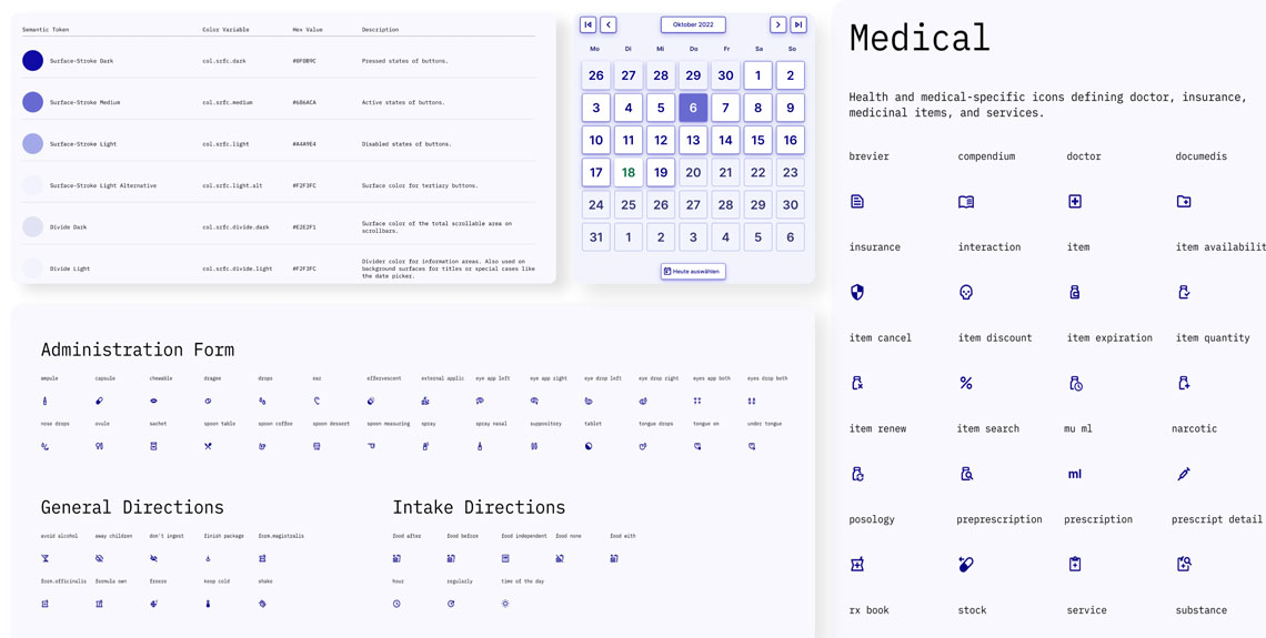
The outcome of our collective efforts was an impactful design system that comprised an assortment of reusable components: color palettes, typography, icons, and UI patterns. I particularly relished the challenge of creating over 300 custom icons, meticulously aligning them with the Material Design icon grid while ingeniously adapting them to pharmaceutical symbols. The posology instructions, in particular, were a fascinating puzzle to solve.
A prominent hurdle we navigated was striking the delicate balance between functionality and usability. My contributions were instrumental in ensuring that the design system we developed struck this equilibrium, offering an interface that enabled users to seamlessly perform intricate tasks while catering to the familiarity of pharmacy staff with the software.
Another significant obstacle I actively participated in overcoming was ensuring the design system's scalability and adaptability for future updates and changes. The team and I took a proactive approach, crafting an all-encompassing style guide and meticulously preparing training materials. These resources played a crucial role in guaranteeing that all designers and developers adhered to the guidelines set forth by the design system.
The journey of crafting a design system for APOS was intricate, interwoven with complexity. It necessitated thorough examination of user flows and extensive research to pinpoint user needs and challenges. As a dedicated team member, I played a big role in shaping the resulting design system, which now stands as a robust framework elevating the user experience of APOS. This project underscores the significance of design systems in the realm of expert software development, and I take pride in my active involvement throughout this transformative process.
- COMPANY: at Ginetta AG for Galenica
- HANDOVER DATE: January 2023
- TAGS: Design System, UX Research, UX Design, Figma, Miro Board


