nanoo.tv educational video platform
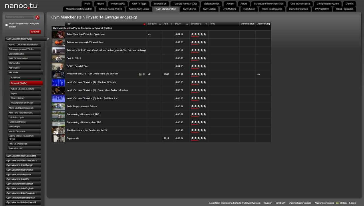
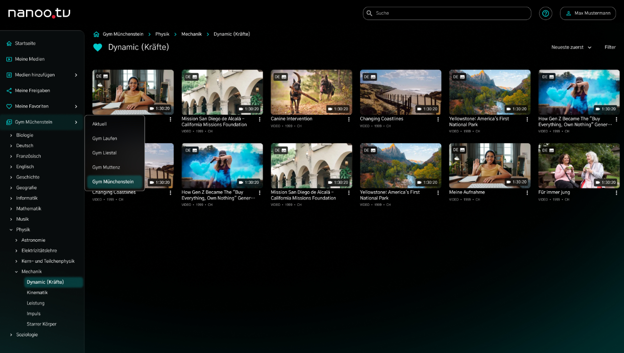
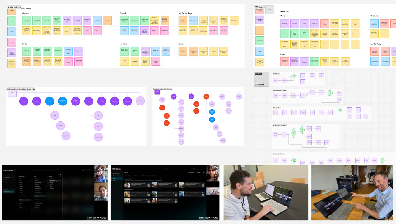
As lead designer on the redesign of nanoo.tv, Switzerland’s top video platform for educational institutions, I focused on improving the user experience by simplifying functionality and enhancing usability. Collaborating with stakeholders, we ensured the redesign aligned with both strategic goals and the needs of educators and students. Through user feedback sessions, I gained insights into their preferences, allowing me to prioritize features and rethink the information architecture.
To reduce visual clutter while maintaining a comprehensive view of the school media library, I applied the principles of progressive disclosure. This approach revealed information gradually, showing users only what was necessary at each step, and making navigation smoother. The resulting design balanced complexity with simplicity, allowing users to access key content without feeling overwhelmed.
Working closely with developers, I ensured the designs were feasible and would function seamlessly in real-world conditions. Regular feedback and an iterative design process helped refine the user interface, maximizing engagement and ease of use.
I also created a scalable design system for nanoo.tv, incorporating reusable components and detailed documentation. This system ensures future updates are consistent and efficient, helping the platform stay aligned with evolving user needs.
This project deepened my ability to lead cross-functional teams and solidified my commitment to user-centered design, with a focus on creating lasting, impactful solutions that foster engagement and growth.
- COMPANY: Werft22
- RELEASE DATE: February 2025
- TAGS: Redesign, IA, Design System, UX Research, UX Design, Figma, GitHub


